Case Studies - SEO
A new brand identity increased the quarterly revenue of Career Conne’xon by 2X!
Company Overview
Career Conne’xon is a human resource recruitment & sourcing firm. With a global clientele, Career Conne’xon has established itself as the market leader in Asian Region. Started way back in 2008, they have a team of experienced professionals. Before the pre-covid era, things were stable for Career Conne’xon but there were symptoms of growth curve going down.
Humans have made the world so advanced that today some bots work better than their creators. Still, humans are the reason behind those bots. This makes me, you, and each human on this planet, the most valuable resource. This case study will take you through a journey of transformation for one of the biggest HR Firms based in India into a dynamic and future-ready organization.
Problem Statement
Many of the prospects did not convert after coming to website, checking company profile, or other elements. This started happening more & more as the covid began to disrupt this Industry. The Senior team of the firm realized a need for the change & COVID struck at the same time.
Things were at a halt along with revenue squeezing itself. That’s a scary situation for any firm but this is an established one in the market.
So, they decided to rebrand themselves and align to the shifting demand of the industry. They found Qoulomb through the reference of our super happy previous client.
Challenges
One Decade is a long time.
10 Years with one branding style and then bringing a change is a courageous step. But, the senior team decided to go for it and we were ready to not let them slip from the top position.
Definitely, reaching out to existing clientele and telling them about rebranding was a tough step. Adding to it, the new message could not be entirely different from the existing brand message & purpose. With these challenges and constraints, let’s find out what happens next.
The WHY of Rebranding - Career Conne’xon
GAP has been an iconic fashion clothing brand in the USA since the 1970s. During the economic crisis of 2008, they felt the drop in sales heavily. This inspired the rebranding strategy of GAP and they invested more than $100 million on the logo itself.
Within 6 Days, they took a U-turn and implemented the previous iconic branding everywhere. The fans, followers, experts, and everyone backlashed their step and the brand got hurt even more.
The reasons were abruptness in the decision of changing branding.
- Underestimating the emotional connection of consumers with GAP brand
- No change in product offerings or strategy was behind the decision. It felt like a market breakdown inspired change.
Because of this, we invested quite a time in inquiring about the reasons behind the rebranding. From the senior management to new members, we conducted interviews to know their understanding of the brand and its values.
There was a mix of answers we received. We have listed down a few of them here
- We help people in recruiting a team from any part of the world.
- We consult the leading MNCs for sourcing the right talent.
- We believe in creating an ecosystem of hassle-free sourcing of talent across boundaries. In pursuit of simplicity, our experts work round the clock to ensure 100% satisfaction & success of our clients.
There were a couple of other statements but not aligned with the brand mission at that point in time. Our experience with brands tells us that newcomers are the weakest to define the brand but here, it was surprising. Newcomers impressed us heavily with their clarity of the brand’s vision.
Because that’s what the company is famous for –
Right talent, Right time, Right place.
OR if I exaggerate it more,
Perfect talent, Perfect time, Perfect place.
And, this is the core concept which we chased down for new brand messaging. Performing some competitor’s research helped us understand the value Career Conne’xon is providing to clients. It was like a double guarantee for clients regarding their talent and skills.
Brand Message
Career Conne’xon brings the right talent at right time for the right place with its double-powered system. Our double-powered system is comprised of next-gen tech & a decade of experience with sourcing best talent.
With this core message, we strategically focused on the identity elements to resonate with this branding. We started working on finalizing the color palette, shapes, elements to produce a logo that speaks for itself.
At the core was – double powered system and the right talent, right time & right place message.
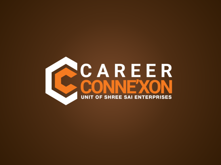
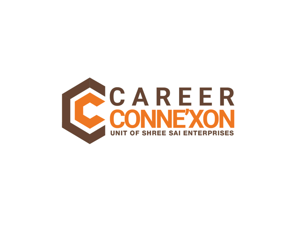
Here are the final versions of the logo.
LOGO
Focused on the core message, the layering shows double powered system. The open-end shape towards the right shows the future-ready approach. Career Conne’xon has offices in 6 Asian countries. The benzene-shaped logo signifies the presence of these offices with 2 open corners also representing offices like closed corners. So, every element places define the brand in one and another way. The logo was loved by everyone in the team when we presented it with a simple explanation and relevance to the new brand message.
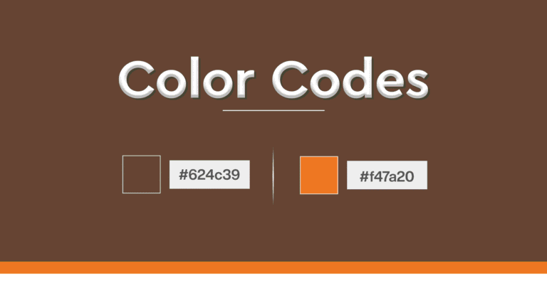
Colors
Oranngy Red
#FD4A36
Haiti (Bluish Purple)
#201630
The selection of colors was not easy. After building the business for a decade, it’s never a good choice to play with visual identity unless strategically needed. Therefore, these colors were taken from the previous branding with minor changes. Blue & Purple created the ‘Haiti’ color which represents trust & grandeur. Orangy red color was to represent the new flowing energy in the brand for future endeavors.
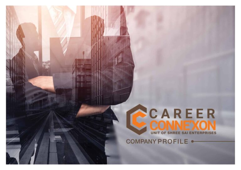
Company Profile
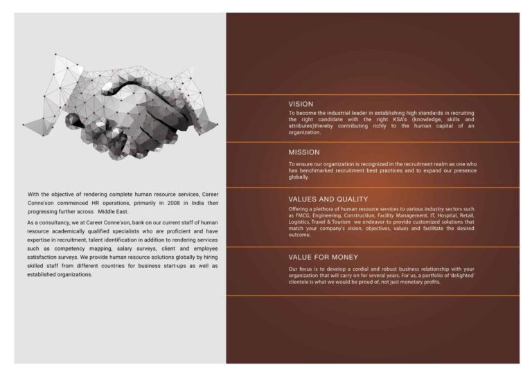
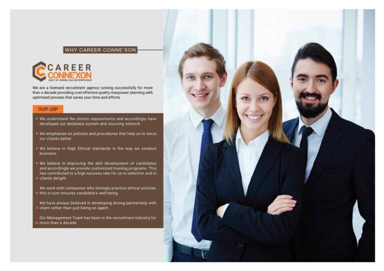
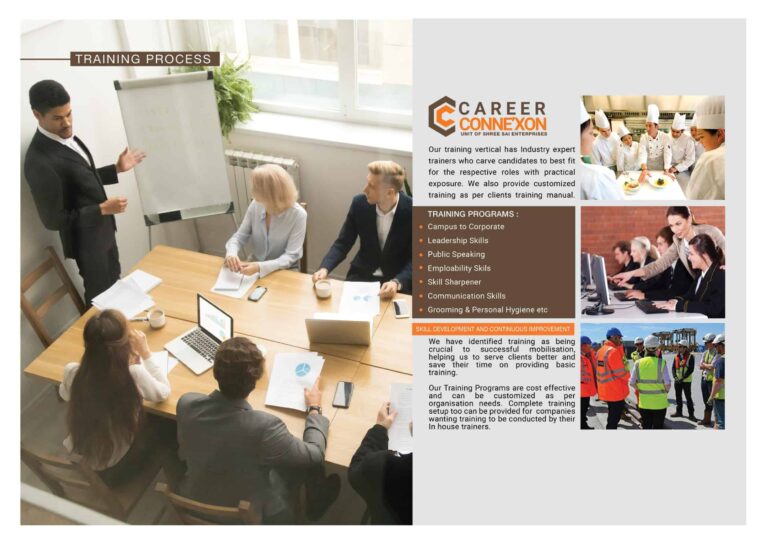
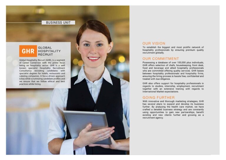
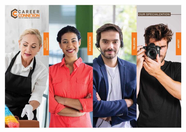
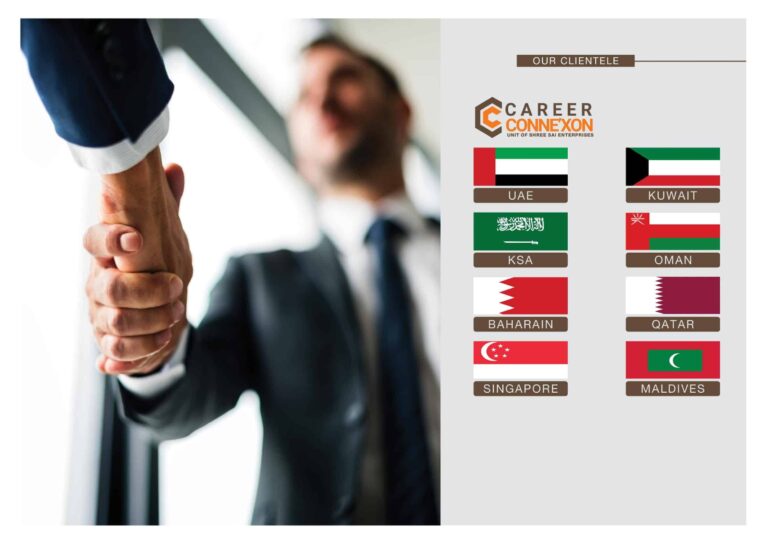
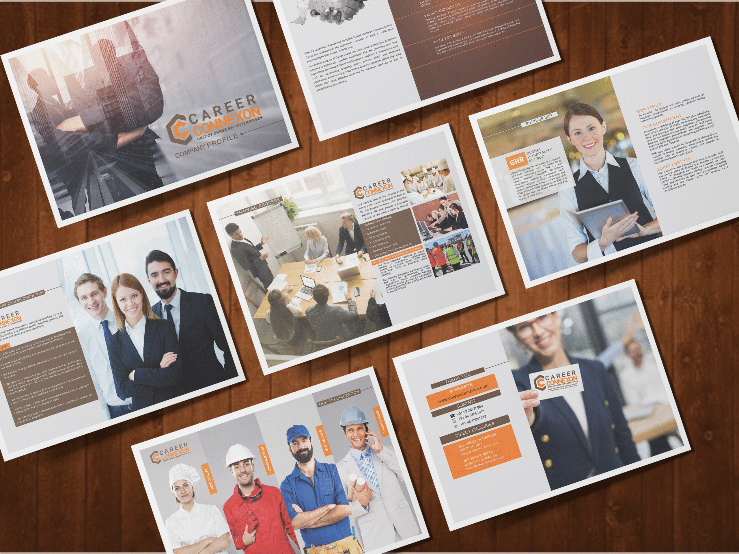
Rebranding a trustable & established company is risky and rewarding at the same time. In the whole process, you have to be careful with the fact that customers liked the previous identity, colors, communication methods & style. Therefore, there are certain constraints while crafting the new identity. Considering this in mind, we also developed a new company profile deck to bring in the energy.
Again, the structure for the company profile was derived from the questions we created.
The purpose of any company profile is to inform the reader about
- what this company does
- why this company is better
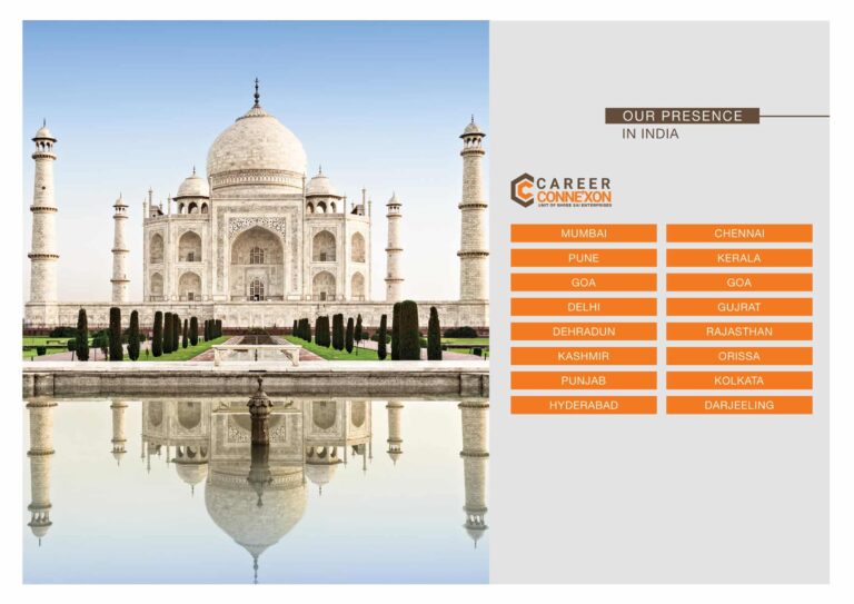
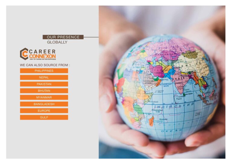
- where this company operates
- what this company has achieved till now
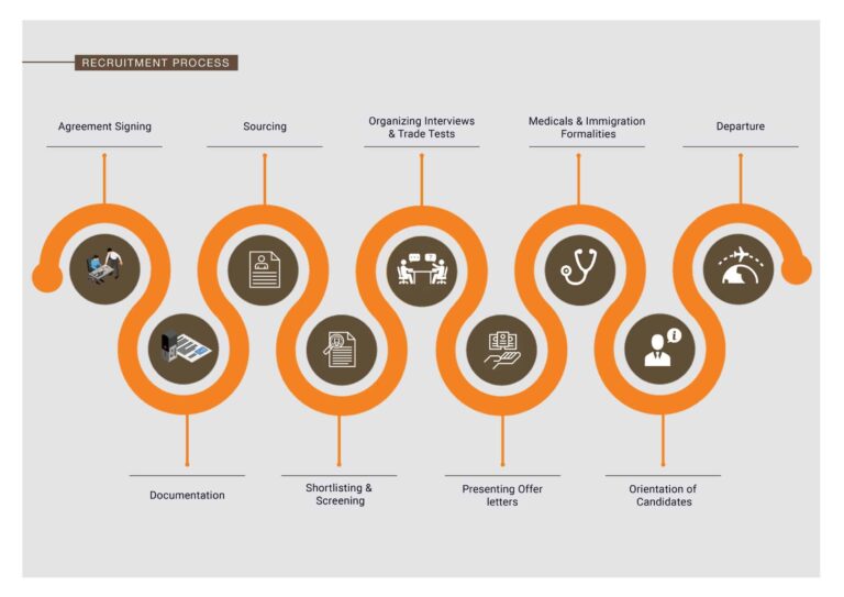
- the process (not mandatory every time, but we prefer it )
- how to contact this company
The answers to these questions become the guideline document for copywriting and design purpose. In creating a company deck, you clearly need to be precise about what to put and what not.
It’s very similar to your website but with very compact space. So, we just started creating content for the slides and designing them.
The purpose was totally on clarity and relevancy of images. It was found that target audience scans these profiles more than they read them. Hence, high quality images with clear reflection of meaning was aim.
Let’s see how we achieved that.


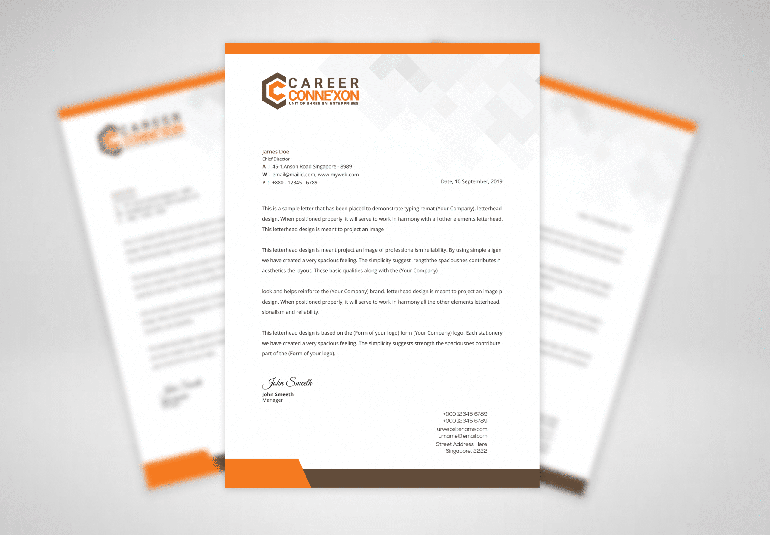
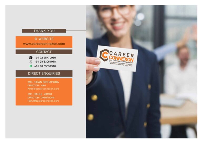
So, these were some snapshots of the company profile.
The whole re-branding process was amazing and it brought up an exciting new phase for Career Connexon.
At Qoulomb, we absolutely love getting projects like that. If you are the one, let’s start with a conversation about the same.
Here, book a call now with our Branding Bold aka Vivek Mishra.
Talk to a Storyteller
Forget the Branding, Forget the Marketing. We will talk about your problem and the best way to solve it even if you don’t choose us. Our passion to help is bigger than anything else.