

If you have ever launched a high-traffic campaign and watched your best landing page show up as 0 conversions, you are not alone. It is not that the traffic was bad, it is that the page was not built to capture the moment someone was ready to act.
Landing pages have one single purpose: converting maximum visitors into buyers. Market leaders like Shopify, LinkedIn, Netflix, and Slack are executing landing page designs flawlessly. Let’s find out the key aspects through the best landing page examples and how you can map their strategies to your own.
- TL;DR
- A landing page must be created for one specific purpose: converting visitors who land directly from other sources.
- Top-performing pages utilize minimalist designs, prominent CTAs, concise copy, and strategic social proof to drive action.
- Target audience research and strict brand guidelines are mandatory. Blindly copying another brand's layout will hurt your conversions.
What is a Landing Page?
A landing page is a web page created for one specific purpose: converting visitors. It is called a landing page because people land on this page directly after following a link from other sources.
You can use many tools to create an amazing landing page for your website. For example, you can leverage website design on WordPress. In a way, landing pages make or break your website. If you have a great landing page, customers will surely check out the whole website. But if the landing page is boring with lousy content, visitors will leave the website altogether. As a result, during website design, landing pages must be given extra attention.
The Power of Minimalism and Above-the-Fold Action
When reviewing landing page inspirations in 2026, a recurring theme among top performers is the removal of friction. The fastest way to conversion is often the simplest.
Shopify
Because of its minimalistic structure, the Shopify landing page has become one of the top responsive landing page examples of 2026. The color scheme is elegant and the quote used is eye-catching. Their claim of being trusted by over 5.6 million active online stores makes them incredibly trustable to visitors. Additionally, the publications under the video help reduce doubts about the above claim. The bullet points are clear and not too lengthy, and the form only asks for essentials.
A truly effective landing page strips away the noise to focus on a single objective. It proves that minimalism, when paired with clear intent, is the ultimate driver of conversion.

Founder Sourabh Yadav
aka Marketing Maniac
Unbounce
Unbounce’s example of landing page design also features a minimalistic design. The white background has been well-matched with images, headlines, and forms. The landing page is straightforward, making it easier for visitors to get a clear idea about the website. Crucially, the CTA stands out against the white background, making interaction easier.
Breather
Containing the most brilliant landing page CTA examples, Breather offers meetings or workspaces to people. It has an instant CTA on top of the landing page, so you do not have to scroll down to use the website if you are a usual visitor. The website uses location services to provide the best options nearby, and it uses simple, on-point copy to let first-time visitors know what the company does.
Netflix
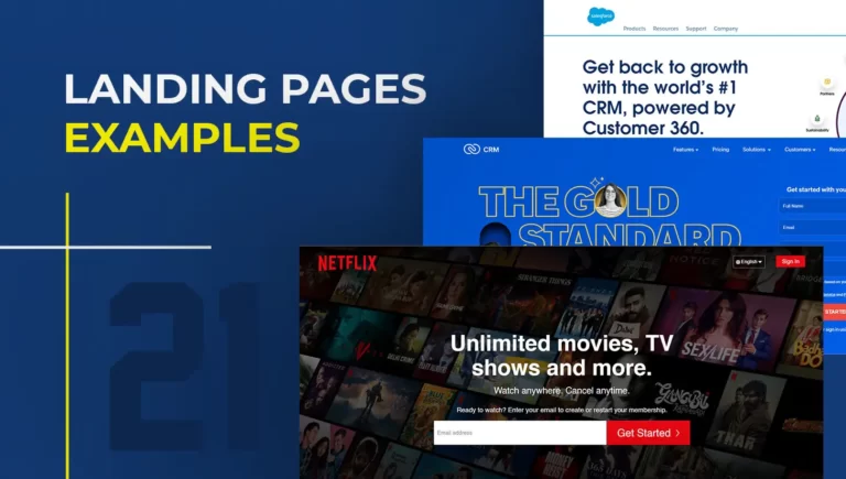
The space where almost everyone goes to chill is known to nail its marketing campaigns. Though it follows a minimalistic design, Netflix still provides loads of information. The landing page only uses 12 compelling words, matched with excellent use of images and a bold CTA, showing that a few words can help you win over a million hearts.
Uber
Uber’s landing page examples are short and straightforward. The page has a single field asking for the phone number or to sign up using social accounts. The logo and the background image clarify what the company does, while the CTA button stands out starkly against the white background.
Lyft
The Lyft landing page features short but bold content. The sign-up form only requires a phone number and does not ask for any other personal details. The subheadings act as social proof, and sections like “why Lyft” and “how Lyft driving works” proactively provide all the required information.
Snapchat
Snapchat uses its brand color for the background of its landing page. The page itself has minimal copy and lets animated videos do the talking, which act as social proofs showing what you can do with the app. However, the black copy on the yellow background stands out starkly and is incredibly attention-grabbing.
Building Trust Through Social Proof and Clarity
The highest-converting B2B blog sections I’ve ever audited all shared one trait: the CTA matched the emotional state of the paragraph above it — curiosity, relief, or urgency. Mismatched CTAs are just noise.

Founder Vivek Mishra
aka Branding Maniac
When a reader is in the consideration phase, your landing page needs credibility checkpoints. These brands excel at weaving trust into their core design.
Slack
Slack follows a different scrolling style where visitors do not need to move up and down to view information. The lead capture form is always present on one side of the landing page. The unique, compelling copy is backed immediately by testimonials to build trust in the visitors.
Codecademy
Codecademy’s simple copy and design, paired with soothing color schemes, landed it the position as one of the best landing page examples. The simple form does not ask for much information, and for visitors not sure about signing up, the page relies heavily on testimonials and stories of past clients.
Zoho CRM
The Zoho CRM landing page uses bold, attractive headlines to showcase the benefits of signing up for a free plan, such as relationship building and ten free users. By strategically using the word “free” in many places, they take advantage of the fact that people are compelled towards the word automatically. The copy is quite descriptive and informative.
Salesforce
Salesforce’s use of infographics makes it one of the most creative landing page design examples. The page contains several free demos for its different services. The compelling copy holds attention, and a dedicated “why Salesforce.org” section helps turn prospects into customers using short but engrossing text.
HubSpot
HubSpot has multiple landing pages for different types of visitors, all built and optimized to drive conversions. The user interface has minimal colors, making the blue CTA buttons stand out. Descriptive copy and infographics are paired with FAQ sections to clear up any doubts prospects might have.
Patreon
When you land on Patreon, it is easily understandable that the space is for artists. A magnificent color scheme, good use of infographics, and enthralling copy make it hard for users to leave. The bold, captivating text ends on a personal note, heavily supported by testimonials that show exactly what happens once prospects convert.
Perfect Keto
The most powerful landing pages don’t rely on endless scrolling or complex features. They win through the synergy of simple, compelling copy and an unmistakable call to action.
Founder Sourabh Yadav
aka Marketing Maniac
Perfect Keto earns its place because of its captivating copy and fantastic color scheme. The headline clearly shows visitors what they will get, highlighting the benefits of a keto diet to cheer prospects on. The inclusion of a quiz shows that the company cares about its customers and creates personalized diet plans for everyone.
Visual Dynamics and Interactive Elements
Interactivity and visual flow keep users engaged long enough to hit the conversion moment. These brands use dynamic layouts to drive pipeline.
Optimizely
The Optimizely landing page has a bulleted, easy-to-scan copy. A demo video is included to show what Optimizely does and how to use it, complemented by amazing, rightly placed visuals and a standout color scheme. The short, five-field form pairs perfectly with a CTA button that creates a sense of urgency.
IBM Analytics
IBM Analytics uses descriptive copy to disclose information, dividing the visually dynamic page into various sections (some showcasing benefits, others showing products). Simultaneously, the white and black display is aesthetically pleasing and highly attractive.
LinkedIn Premium
This LinkedIn landing page uses minimal copy and attractive infographics to increase conversions. Using graphs and figures, the page visually showcases the importance of the premium account and how it can help you grow your career.
Amazon Prime
Amazon Prime uses striking visuals, an eye-catching black and white scrolling pattern, and a brief copy. As you scroll down, strategically placed benefits of joining Prime are revealed. The synergy of brief copy and attention-grabbing images makes visitors halt on every point, leading to a high conversion rate.
Zoom
Zoom’s landing page is neither lengthy nor descriptive but displays everything a visitor needs to see. A slideshow of images and text shows Zoom’s benefits and unique aspects so visitors can see why they should join without scrolling down. For those who do scroll, the page is full of social proofs.
Kissmetrics
A captivating headline and the image of an open laptop showing graphs and charts clearly show what the company does. The color scheme works well, ensuring the green CTA stands out for visitors to get a demo. As you scroll down, you see a qualifying question: “is Kissmetrics right for you?” with answers below that are sure to turn a prospect.
Landing pages make or break your website.
Download the Conversion Audit Template to find where your existing pages are leaking pipeline and how to fix them using data-driven UI.
Measure What Actually Moves Pipeline
Landing pages can be designed in multiple ways, but you should not copy or follow any single page just for the sake of it.
Working on the UX and UI after deeply studying the target audience is what results in an accurate, high-converting landing page design. It is also very essential to stick to your own branding guidelines while using colors, shapes, and elements for the landing page. By measuring what actual moment prompts a user to convert, you can build a page that actively moves your pipeline forward.